The messaging of an idea... feedback — PART 4

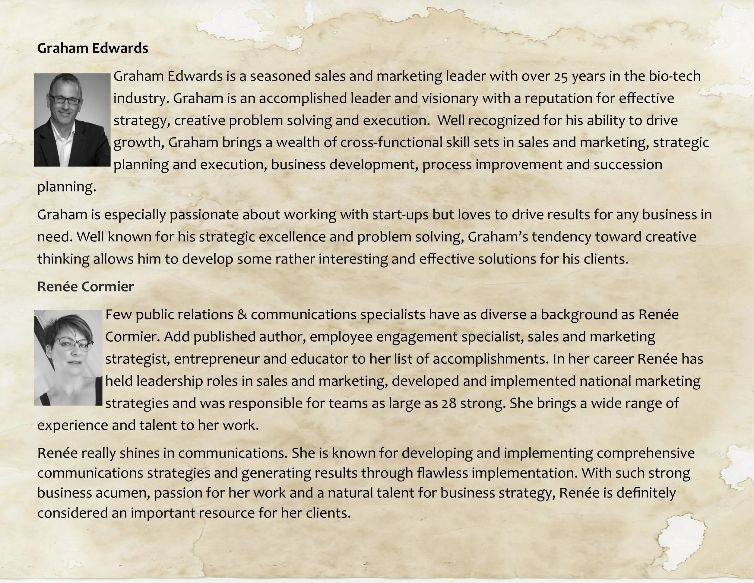
As Renée Cormier and I continue to work our way though "The messaging of an idea" (in an attempt to offer perspective and build discussion to get really good at it) I received a comment on my last blog post.

feedback.jpeg

Lisa Gallagher had offered some perspective on presentations and mentioned she had hoped I would have offered an example of a "good one" — due to confidentially agreements and sensitivity to people's privacy it is actually easier said than done. Recently though I was speaking to an associate of mine and he had no issue with me using one of his recent presentations as an example. He is always looking to promote his business, expand his social media strategy, and is always looking for feedback (which it seems scores a solid 20).

What I am including here is a video of the presentation, which does move the conversation from simply about the format and structure of a PowerPoint slide deck to something bigger —

  • How is the presenter using the slide deck?
  • How are his abilities as a speaker?
  • What is the utility of using a PowerPoint slide deck for a video
  • What about the video itself
  • Et cetera...

The Presentation —

To Lisa's original request, if you want to consider the slide deck itself it would be best to mute the video and follow the presentation through from beginning to end — overall I think this is a rather "tight" slide deck that tells a story, identifies the important points for consideration, and it isn't much of a leap to envision the narrative of the presenter.

But of course a slide deck does need a presenter, and this expands the considerations for optimizing the messaging of an idea, and starts to scratch at the modes (channels) that can be used to that end —

  • What the presenter says and how he says it.
  • Considerations as to when you expand to different modes of messaging.
  • Managing your resources to get the most you can without compromising your message.
  • Is what you are doing aligned with your strategy?
  • Et cetera...

In the end thought it's just a PowerPoint deck, and although it has lots of utility, messaging an idea is much more than simply having a slick, tight, PowerPoint presentation, and presenter.

And now to the point of all of this (other than getting Lisa her slide deck example), which is the importance of getting constructive feedback; something needed to progress your idea. Feedback is how you pressure test your idea (or whatever you are presenting) to ensure it can withstand the real world. That feedback is then used (in context with your objectives and strategies) to ensure your messaging is exactly what you want (or need).

Having given Renée a heads up that a simple question would be coming her way, I will ask it now — "So Renée (and anyone else for that matter), can I get your thoughts on the presentation and the video, as well as your constructive feedback?" 

There is courage in asking for feedback, and it is important to appreciate two things in doing so —

1) There is never any growth without feedback.

and

2) “It is not the critic who counts; not the man who points out how the strong man stumbles, or where the doer of deeds could have done them better. The credit belongs to the man who is actually in the arena, whose face is marred by dust and sweat and blood; who strives valiantly; who errs, who comes short again and again, because there is no effort without error and shortcoming; but who does actually strive to do the deeds; who knows great enthusiasms, the great devotions; who spends himself in a worthy cause; who at the best knows in the end the triumph of high achievement, and who at the worst, if he fails, at least fails while daring greatly, so that his place shall never be with those cold and timid souls who neither know victory nor defeat.” —Teddy Roosevelt

iamgpe

Renee & Graham Blog Plate.jpg

The messaging of an idea... granularity — PART 2

Well it seems my friend Renée Cormier is finally getting out from underneath the flu she was fighting and has started to jump on "The messaging of an idea" bandwagon — I actually think this is a big topic with much more discussion yet to be had. Here is the link to her latest post.

granularity.jpeg

As always, she has offered some solid insight but I will say (with tongue in cheek) that she is blatantly perpetuating the image that she is a pragmatist and "I'm a head in the clouds, broad brush, idea and theory guy". Although some of this may be true (60 % tops), I'm going to show her that I can get pragmatic  (or as I like so say, "granular").

gran·u·lar [ˈɡranyələr] ADJECTIVE — characterized by a high level of granularity

gran·u·lar·i·ty [ˌɡranyəˈlerədē] NOUN — the scale or level of detail present in a set of data or other phenomenon

No matter how you use it, as an adjective or as a noun (or interchangeably) it's a great business word that says you are getting into the DETAIL — and with that Ms Pragmatic, I'll show you...

MY GRANULARITY

I appreciate that there are direct alternatives to PowerPoint, and even different modes to get an idea across (such as videos, old school acetates, or sock puppets) but in the end the PowerPoint presentation is so entrenched it'll be here for a while — and besides, I really like it.

Why do I like it you may ask?

I suppose one of the reasons is I have created thousands of slide decks for one reason or another over the years and I am really, really comfortable with it; up and above that I like the versatility of what you can use it for — presentations of course, but I have also used it as a training manual template, for process mapping, reporting, and graphics in videos. I find it extremely useful as the foundation for so many things. Oh, and you can build upon all those presentation decks you have made and actually save time.

All things considered, I wanted to get granular with using PowerPoint for presenting an idea and effectively getting your message across.

Granularity Point #1 — If you are asked to work with a corporate PowerPoint template... use it. When you use it don't change it and follow the guidelines to the letter, because if you don't, someone at the back will point it out, disrupt your flow, and spend more time then you think complaining about how you can't follow the simplest of guidelines. If you have the flexibility to develop you own presentation template it is important to keep it simple with a white background — you may think that a blue or red background is creative but it just makes it hard to read.

Granularity Point #2 — This is more a list of dos and don'ts:

  • Don't use sound.
  • Don't use animation.
  • Don't work under the impression that the more words mean a more effective message.
  • Don't embed videos into your presentation.
  • Don't use cheesy clip art, stickmen or kittens.
  • Don't use any font style other than Helvetica (unless your corporate template sees it differently).
  • Don't use a font size that can't easily be read on the screen from six meters away (twenty feet).
  • Don't use more than ten sides to get your idea across (excluding appendix)

The dos are anything that aren't don'ts (but even this is not true all the time).

Granularity Point #3 — PowerPoint presentations are not meant for you to read while you are standing up at the front of the room — they are meant to hold your audience on key points that tell your story. A PowerPoint is simply a glorified list of talking points — so what every you do, don't stand in front of your audience and read from the screen.

Granularity Point #4 — What exactly are the components of an effective slide? There are three components for the most part: a) a graphic or picture b) text (including the title of the slide) that speaks to the key message of the slide and c) a take away message at the bottom of the page (more often than not in red). Try to have as much white space as possible without compromising your message.

This is where content and format collide — and it takes time to get good at both. If you know someone who is good with composition and design get them to format your slides. 

Granularity Point #5 — This could probably be categorized in point #4 but I think it will offer an important point to tie much of this granularity together. If you need to use a chart in your presentation (or pitch) make sure the audience can read it — if you find yourself saying out loud "I know this chart is hard to read and busy..." then I will suggest your presentation wasn't ready for the world to see. It is imperative to ensure everything is easy to read and interpreted by your audience.

Your message will be lost if your audience is squinting and saying to themselves, "What exactly does that say?"  

Granularity Point #6 — Present the slide deck as if it is a conversation — granted, if it's a large audience it's more of a one sided conversation but it still invites engagement, involvement and most importantly questions.

I hope I have done well by Renée when it comes to my ability to get granular.

iamgpe

Renee & Graham Blog Plate.jpg

Moments — startups are not just for Ys and Zs anymore.

start-up.jpg

"What's really bothering you?"

"Don't get me started — not taking advice and living in a fantasyland are the 2 that immediately come to mind."

"Sounds like that other startup we were dealing with a while ago."   

"Yeah  — it's the 'I'm the entrepreneur and I know everything so why would I possibly need advice in the sales/marketing/tech/finance area by subject matter experts?' syndrome — it's a real thing."

Although there is some artistic licence with this short conversation it really did take place, and although there are many themes that you could glean from it, I came away with two.

         #1) The startup is not just reserved for the bright eyed youth of today (with an idea and boundless energy) because more and more "40 and 50 something" professionals are now finding themselves in the startup arena — more often than not spit out of a corporate setting with an idea, lots of experience, and maybe not so much energy. Everyone is flocking to wear the badge of honour that is the "entrepreneur".  

          #2) There is nothing worse than a "40 and 50 something" professional with experience and some success under their belt — sadly they believe they know what the fuck they are doing better than anyone else. And yes, I realize those annoying 20 something's also believe they know what the fuck they are doing better than anyone else, although to be fair, it's expected from them because that's what comes with being young (we've all been there if you remember).

I should mention that as a "50 something" I believe I know what the fuck I am doing better than everyone else, although to be fair, I also realize I need to listen to those who actually DO KNOW BETTER — as well as adopt what I hear. I will admit it's a work in progress with improvement each and every day.

The real rub in all of this is experience actually does get you a little closer to knowing what the fuck you are doing better than anyone else, so make sure you tap into that experience whenever you can — be it yours, or someone else's.

iamgpe